Cradle - Babysitting App
Skills: Brand Development, UI/UX design, Wireframes
|
Cradle is a conceptual babysitting app I came up with while participating in the #DailyLogoChallenge. For this challenge, the prompt was to come up with a logo that manipulated a letter in a wordmark. I came up with this concept changing the “C” into a quarter-moon and enjoyed creating the branding so much that I decided to flesh it out even more.

|
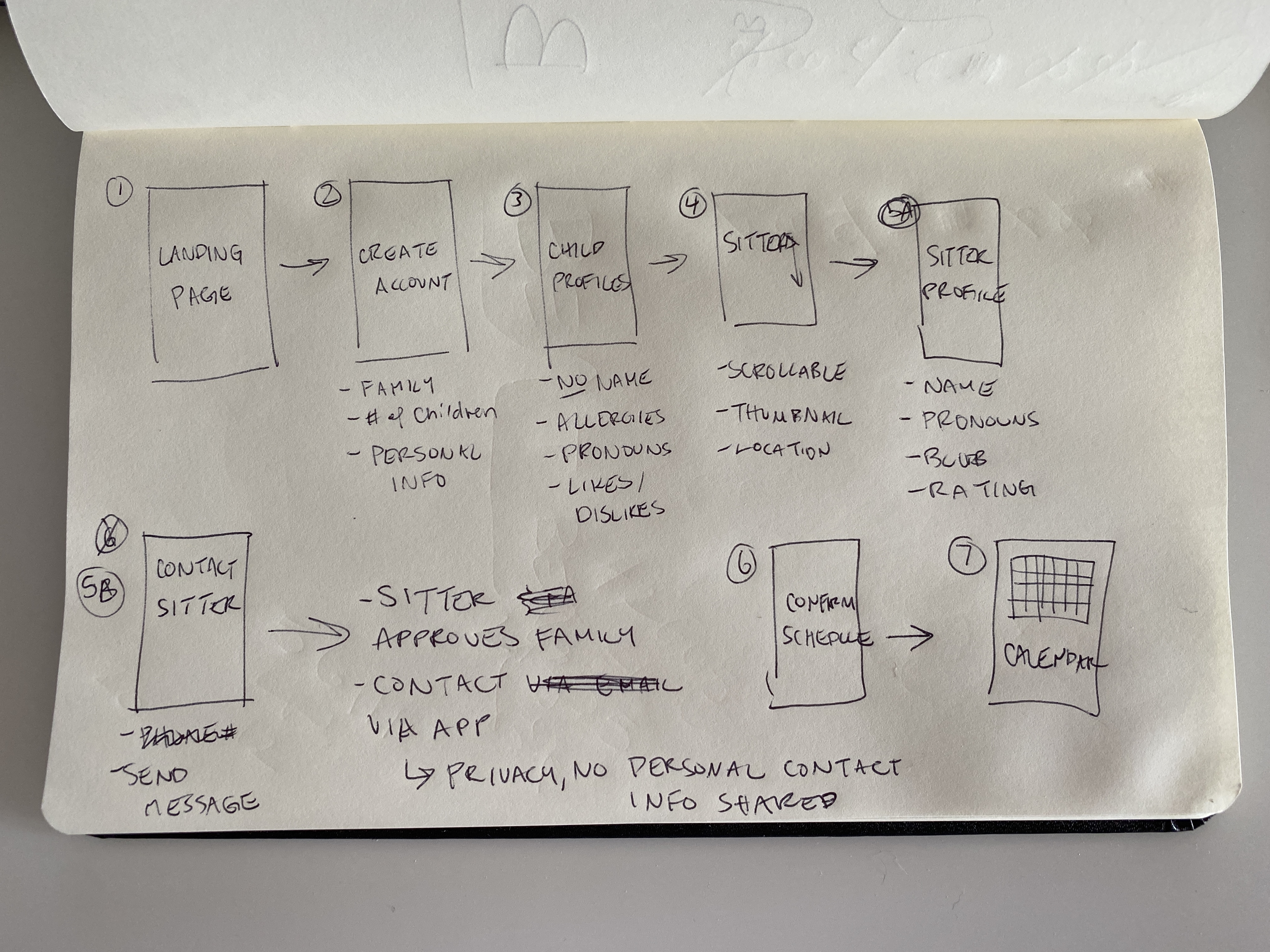
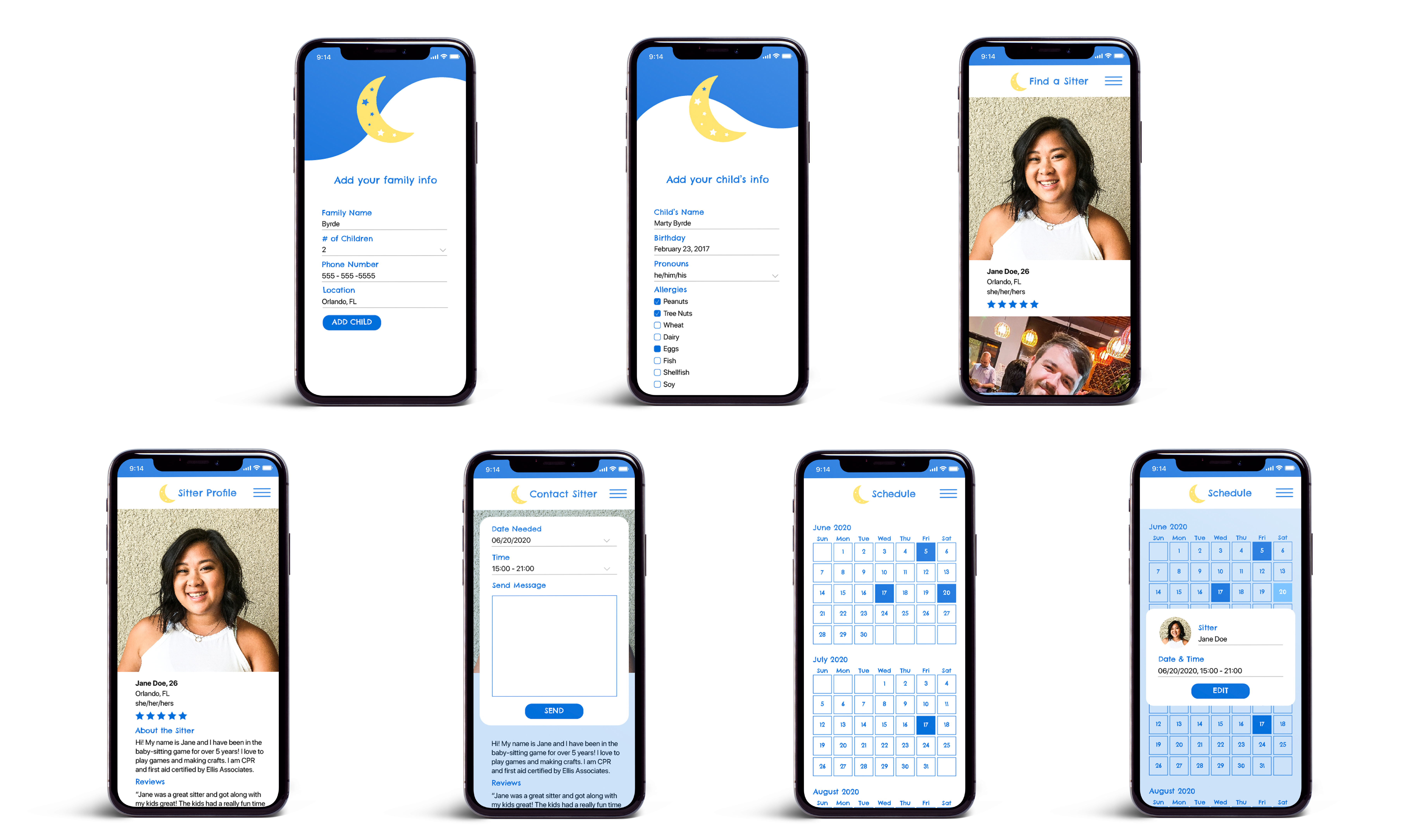
I created initial wireframes to help plan out the interface of the app then brought those ideas into Adobe XD to visualize the UI/UX. This interface is from the perspective of a family that is signing up for the app to find a new babysitter. Through this process I wanted to focus on the needs of the audience. I knew that personal information would be sensitive here, especially when dealing with families and minors. Ideally, the app would use top notch privacy settings and both families and sitters would feel safe inputting their information. |


|
I wanted to keep the branding very youthful and welcoming. I decided to go with icons and text that had a loose and sketch-y feeling to them, almost like a child had written and drawn them, but of course, keeping it legible. I also wanted to keep the pages minimal and straight to the point, to not overload the user with too many choices or too much information to add. |
